Wealth Wise Partners: WordPress to Next.js Rebuild
A network of financial advisers had a website that looked like a template. I rebuilt it from scratch in proper code with a new, more premium look, moved it off WordPress onto its own domain without their email going down, and the client has kept commissioning new sections since.
Client: Wealth Wise Partners
Project Details
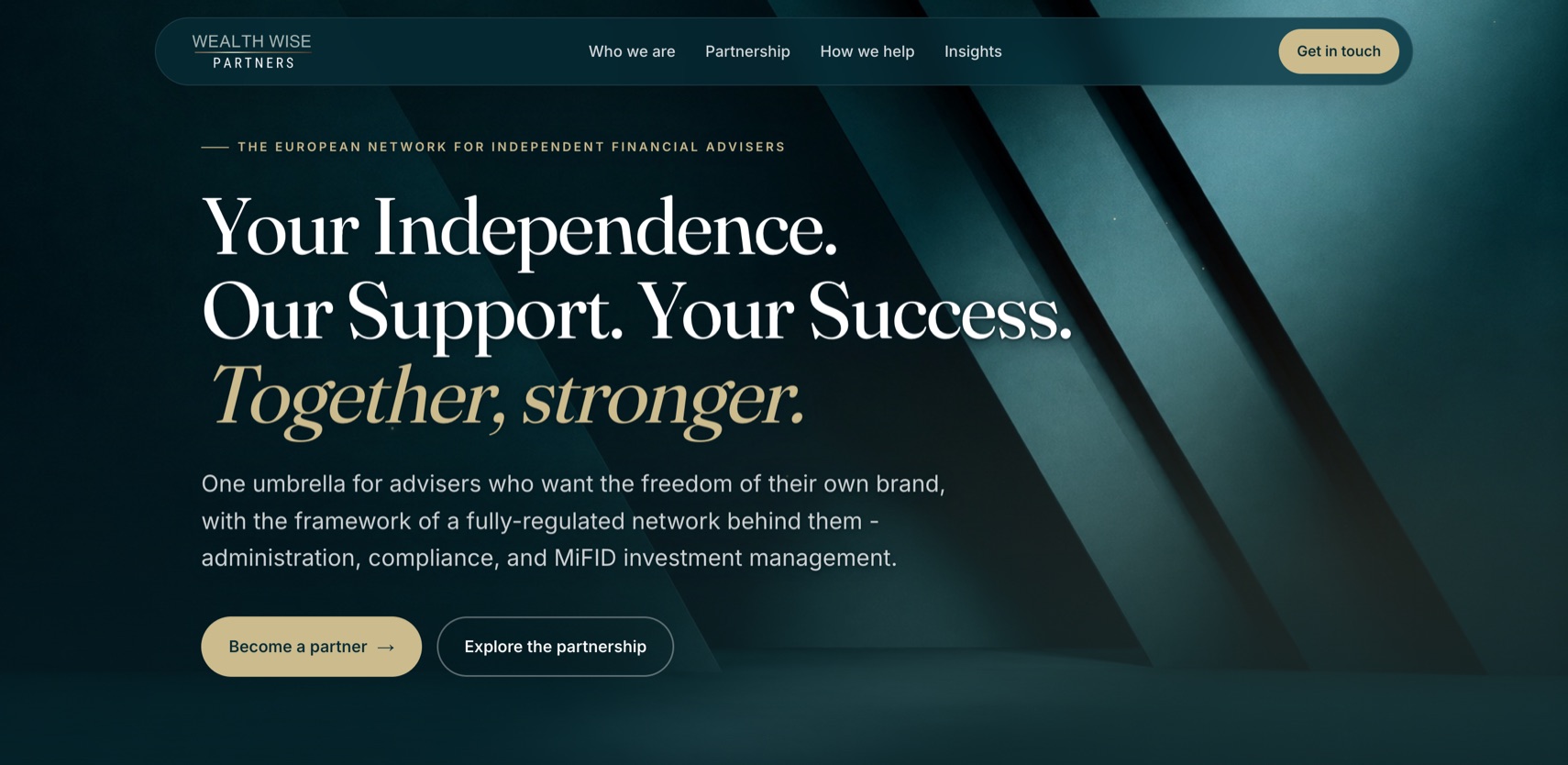
Wealth Wise Partners is a European network for independent financial advisers: one umbrella of regulatory licences, administration and compliance, under which advisers keep their own brand. Their WordPress site said the right things and looked like a template. I migrated it off WordPress and rebuilt it from scratch in Next.js, with an editorial serif look, one restrained moment of motion and content that search can actually read, then launched it on the client's own domain on 6 October 2026. The DNS switch to verified live took under ten minutes and the company's email never dropped. Seven feedback rounds in, the founder's verdict on a call was "We love the work that you've done so far." The site has kept growing since, with client-facing country pages and a guides section commissioned after launch.
Challenge
- A template, and it showed. One stock photo of a rowing crew reused across the site, all-sans type, no motion, and copy that explained instead of declared. The founder's biggest complaint was that the site did not look like the business it described.
- A partnership pitch with no people in it. The strapline was "not just a network, a partnership", yet there was no About page, no faces and no founding story anywhere. The licences and jurisdictions that are the real substance of the offer were off the page too.
- Two readers. Advisers are the buyers and want the regulatory and business case. End clients increasingly land on the site as well and want to know who these people are and whether to trust them.
- A domain with live mail on it, held by someone else. The domain carried the company's Google Workspace email and sat in a third-party registrar account. The move to new hosting had to keep mail and search intact and end with the domain in the client's own name.
- Taste that could only be found by looking. The client knew the hero graphic was wrong before they could say what right looked like. The process had to let them choose between real options rather than react to one guess at a time.
Approach
Fixed-price scope: one stage, two payments, add-ons one at a time
The brief arrived as a "lick of paint". I scoped it as Stage 1, one fixed price broken into four cost blocks so the client could see where every euro went: the five-page rebuild off WordPress, a new About page, one moment of home-page motion, and hosting, domain and launch. Two payments: a deposit to start, and the balance due after the client signed off the finished site on a preview link, before it moved to their own domain. Everything beyond that was a Stage 2 add-on, quoted in writing when asked and never scheduled before. Nothing landed on the bill mid-build without an agreed number first. When the client came back for the next build after launch, he proposed the same two-payment structure himself.
Editorial design direction, built in Next.js
His three reference sites were all template builds leaning on the same geometric sans fonts, so the fastest way to out-tier them was a lane none of them occupied: serif headlines over a neutral sans body. I paired Fraunces with Inter, loaded through next/font, kept the brand's own teal, gold and sage palette, and disciplined gold to one job: the primary call to action and key highlights. Generous whitespace, an editorial grid, and a stat band that counts up on scroll to put the proof high on the page. The site was scaffolded in Next.js 16 with Tailwind and statically generated, and the first full pass went onto a Vercel preview link in the first days of the build, so the client saw the look before the pages filled in.
Five live hero options instead of one more guess
The first hero graphic was abstract line-work. The founder's voice note called it too busy and asked for something closer to luxury materials. I rebuilt it as silk folds with gold-foil trims. Still not it. Rather than guess a third time, I built an options page on the preview domain: three directions side by side, desktop and mobile, each one traceable to something he had said or sent, and noindexed so search would never see them. The pick came back as the angular panels but with more texture, and his wife sent two reference images showing the depth they wanted. I built options 4 and 5 as faithful recreations of those two images. Option 5 was confirmed as the final image in under a day. The one addition they asked for, subtle gold within the darker streaks, became 18 hand-placed gold specks drifting up the artwork's grooves: home hero only, half density on mobile, hidden under reduced motion.
Restrained animation, tested on a real iPhone
The signature moment I first built, two strokes drawing in from opposite sides to lock into the W monogram, was dropped at round 1 because the client was not keen on the W. What shipped instead is a three-step opener: the brand graphic and name appear, the real navigation bar drops in as the eyebrow line arrives above the name, and the page scrolls in. Five seconds, skippable with any click, scroll or key, once per browser session, and switched off entirely under prefers-reduced-motion. Everything else is a quiet reveal-on-scroll baseline, all hand-written CSS and SVG, no animation library.
Two of the bugs only showed on a real iPhone. iOS Safari rasterises SVG blur filters seconds-slow and redoes it on every animation frame, so the hero graphic now has no filters at all and fakes its glow with stacked strokes. iOS Safari also drops the first IntersectionObserver callback on load, which left content hidden on mobile. The reveal engine now reveals anything already in view immediately, backs the observer up with a scroll listener, and has a failsafe so nothing is ever left hidden.
Insights rebuilt as indexable content, forms rebuilt for GDPR
The six Insights articles were PDF embeds on the old site, invisible to search. They carried over as PDFs and their text was extracted into real HTML prose on each article page. Below 768px the embed gives way to a native full-screen "Open the full report" button. The client's 21-item content round closed in one build, bar two items that were still theirs to write. The About page became a founder message with photo and signature rather than bios, at their request. Cookie and privacy policies were rewritten for the new site. Contact and newsletter sign-up run on two separate Formspree forms delivering to their inbox, with a honeypot instead of a CAPTCHA, 16px inputs so iOS does not zoom, and the marketing opt-in unbundled from the enquiry consent, which the old form had tied together.
DNS cutover and WordPress migration with zero email downtime
The domain moved out of the third-party registrar account into mine, the registrant was updated to the client's company, and after launch it was pushed into the client's own account, accepted on 5 November 2026.
The redirect map covers the two page slugs that changed and the eight legacy PDF URLs, all permanent redirects to the new routes, so every URL in the old sitemap resolves and search equity carries over. The live DNS zone turned out to be at the registrar, not in the hosting panel, and it carried fourteen records including five Google Workspace MX records, SPF and site verification. Only the apex A record and the www CNAME changed, at a 30-minute TTL, with the old site left untouched as a rollback. A final regulatory cross-check from the client's side came back the day before launch; the edits were applied and deployed that morning. Switch at 08:58, SSL issued at 09:02, every redirect, content and mail check passing at 09:04.
Results
- Live on wealthwisepartners.org on 6 October 2026, under ten minutes from DNS switch to verified live, with zero email downtime.
- The client came back for more. Client-facing country pages for Portugal, Greece and Spain and a guides section were commissioned after launch, on the same two-payment structure the client proposed himself.
- Every old URL still resolves. The two changed slugs and the eight legacy PDF links all redirect permanently to their new routes, so nothing indexed was lost in the migration.
- Seven feedback rounds, most shipped the same day. Round 1 arrived at 11:50 and was live on the preview by 12:05, fifteen minutes later.
- Five hero directions presented, decision closed in a day. The client picked from real pages on the real preview domain, not mockups.
- The domain is in the client's own name, moved into their registrar account after launch with mail intact.
Client Feedback
"We've got to know you a little bit. We like the way you work. You're very clear, you're very concise, and you're actively managing us. We like it."
"You're our lady. We love the work that you've done so far. We're gathering momentum, so we really appreciate your input."
Marcus Queree, Founder, Wealth Wise Partners
Tools Used
Next.js 16, React, TypeScript, Tailwind CSS, Vercel, Formspree, GoDaddy DNS, Fraunces and Inter via next/font


Get Started
Looking to Hire?
I bring 19+ years of cross-functional experience to every role. Connect on LinkedIn to learn more.
Need a Consultant?
Start with a one-hour session on the decision in front of you, or send me the brief for a longer engagement.